
FastPharm
Responsive web design for delivery orders from a local pharmacy.


FastPharm
Overview
Interested in investigating the public's interaction and experience with pharmacy delivery apps , we researched and designed a responsive user interface for the online pharmacy delivery order platform.
Team
Michelle Lu
Preethi Surapaneni
Role
UX research
pitch presentation
Duration
(1 month)
Tool
How can we improve the user experience of the online pharmacy delivery application for a wider usage?
 Once we developed a set of interview questions, we asked four users of existing platforms about their delivery order experience. Through the interviews, various advantages and disadvantages of pharmacy delivery applications have emerged, which we organized into a chart shown below:
 Such insights then allowed us to think of potential social and material concerns to keep in mind while designing an inclusive and user-friendly interface:
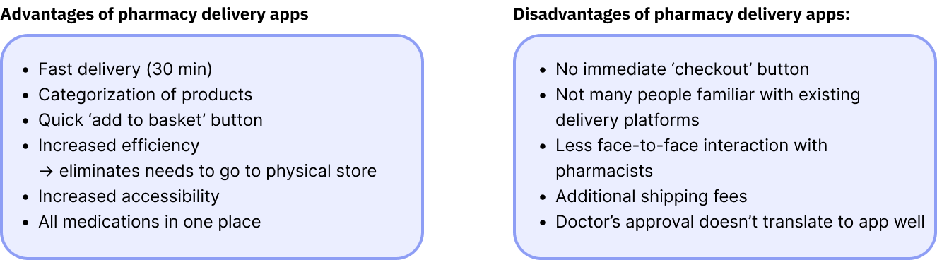
Three scenarios each revolved around the following wants respectively:
"I wish I didn't have to do my own research to figure out what kind of medicine would work the best to fix my symptoms."
"I wish I could talk to the pharmacist for their opinion while browsing through the products."
"I wish I could easily see all products related to a specific category so that I don't have to look products up one by one."
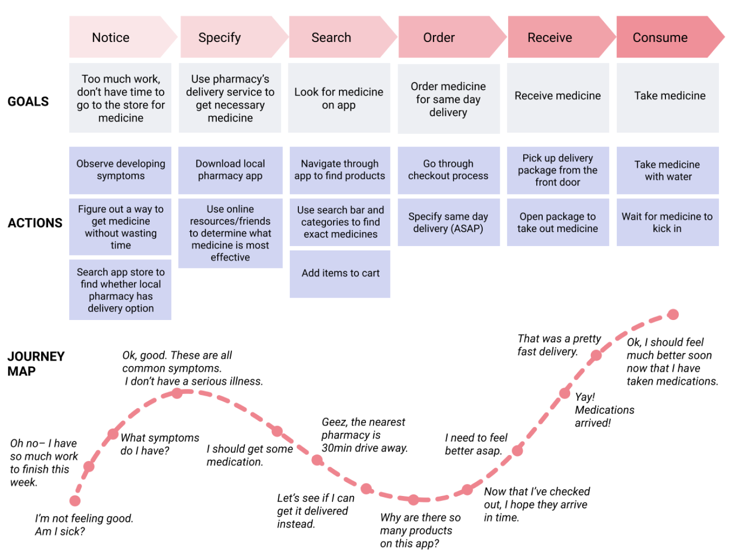
(View individual customer journey maps)
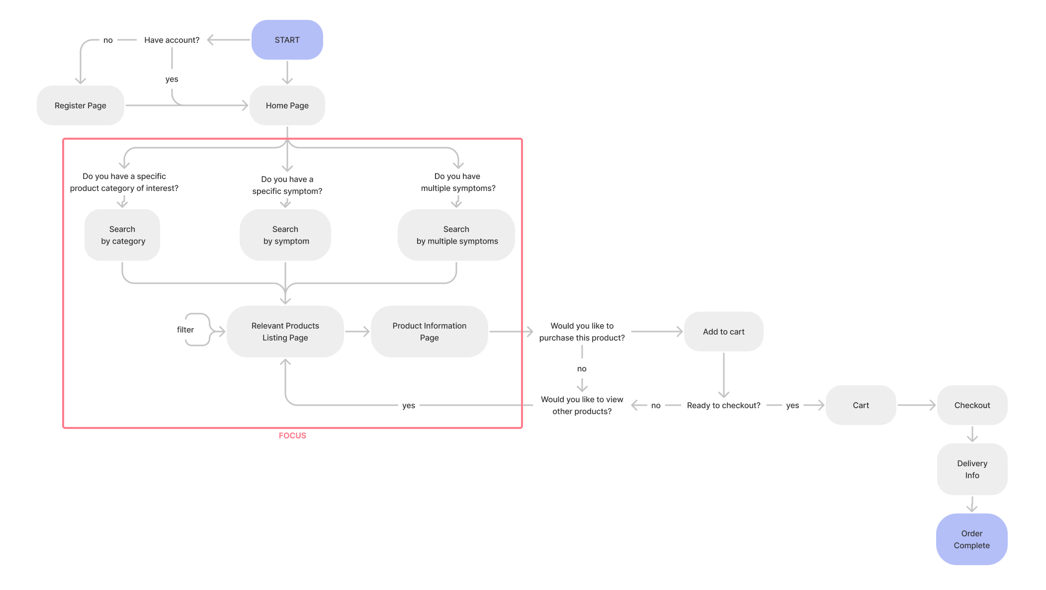
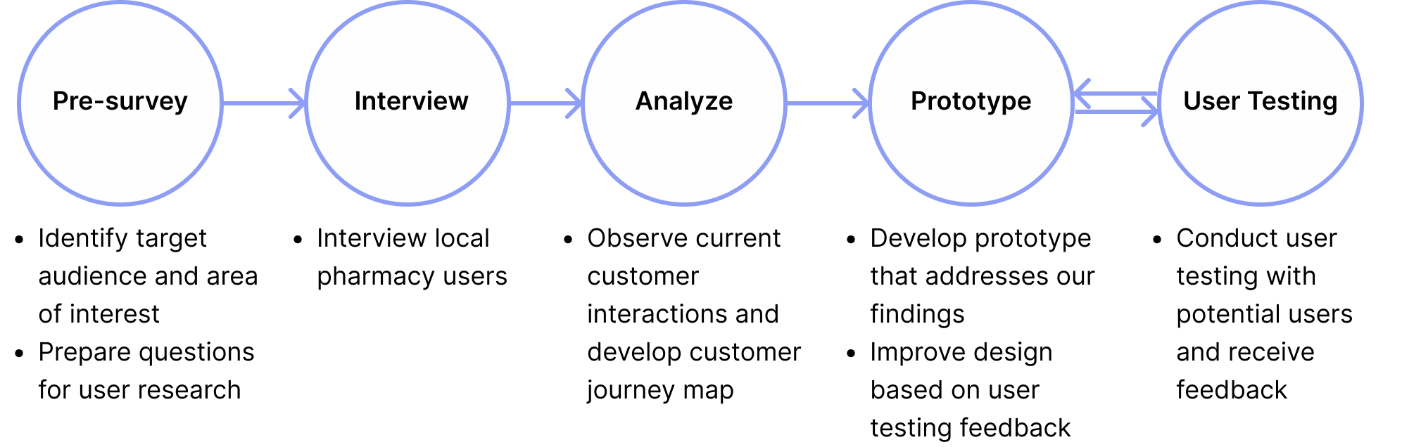
We also gained great feedback and suggestions in the process of user testing. Because we were able to hear the user's thinking process as they navigate through the interface, we learned that simplifying the navigation bar and adding more filters to the products listing page would improve the user experience.
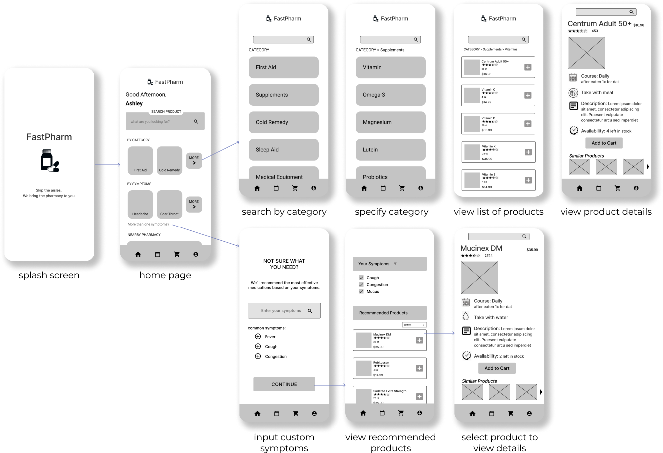
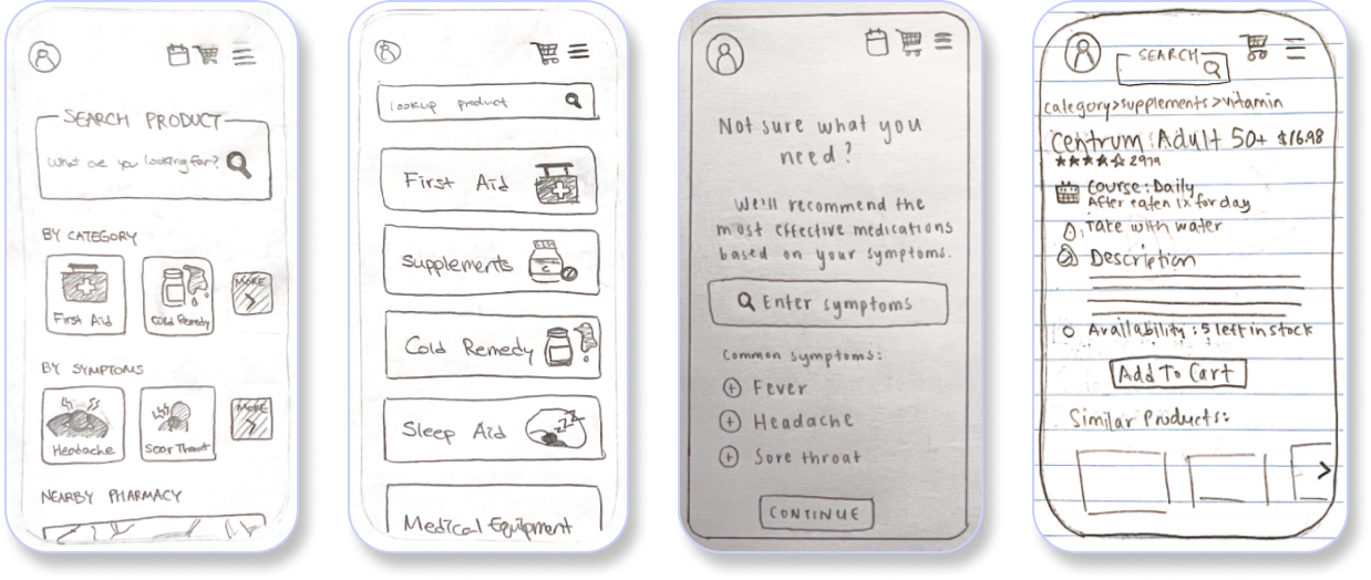
In the prototyping portion of the project, I was mainly in charge of designing the mobile version of the FastPharm. Since our phones nowadays all have the scrolling interaction that has become intuitive to the mobile users, we utilized the vertical layout for the categories and product browsing pages on mobile.
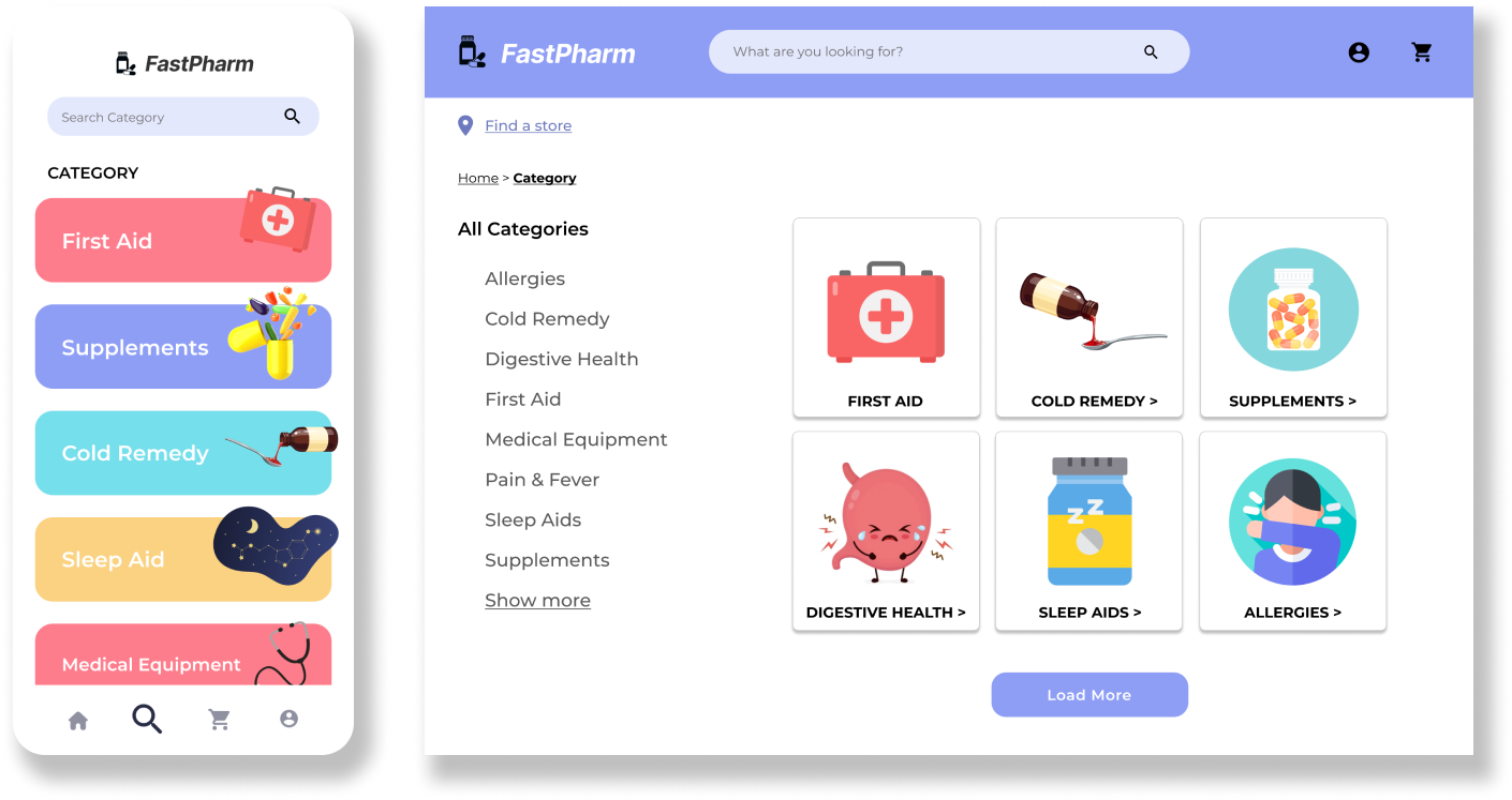
For the desktop version, we redesigned the product browsing pages on the desktop screen to display the product cards in a horizontal manner. Such decision was made in consideration of the extra space the desktop platform offers compared to the mobile platform. We further utilized the extra space by placing the list of all categories on the side to help the user navigate the extensive catalog of products; however, in our hierarchy of importance, we did not consider this a high-priority feature, which is why it was left out of the mobile design.
View mid-fidelity prototypes:Customized Search by Symptoms
One of the feedback we received was to have the platform suggest product recommendations based on additional information as well like the duration or the severity of the symptoms. Previously, we only prompted the users to input what types of symptoms they were experiencing, which wasn't specific enough to provide customized search experience.Hence, our high-fidelity design asks the users to indicate the duration of the symptoms using the dropdown selections, as well as the severity of the symptoms in a scale of three. Such additional information will then be used to determine the common type of illness with the indicated set of symptoms, which allows the users to have a personalized product search experience.To secure user's health, we also included a caution that states should the user in need of a serious medical help, they should dial 911 immediately.
More Informed Product Recommendation
In order to help users make a more informed purchase using our platform, we inlcuded 2 new features to help increase transparency regarding how the website is recommending the products. The first is the type of sickness suggestor at the top that informs the users that they may be having a specific sickness based on their symptoms input. By using the predictive nuanced languages like might and including the sentences like if symptoms persist, please seek professional medical assistance, we clarified that what this platform suggests isn't a confirmed diagnosis by a doctor or a pharmacist.The second feature is to provide additional recommendations among the products that have been filtered by symptoms based on the highest rating, the best value, and the fastest relief. We ideated such that the highest rating would be based on the user review, while the best value and the fastest relief would be based on the pharmacists' recommendation.
Similar to other ecommerce platforms like Amazon, we wanted to help our users make easier and more accurate decisions by providing helpful information and metrics.
Real-time Chat with the Local Pharmacist
Should the users not know what to get even through the three different ways of product search mechenisms, they can directly have a chat with the local pharmacist using the chat feature on our platform. We included this feature to provide greater flexibility to the users, as humans are far more complex than what a machine can cover.Although we designed this interface with accessibility in mind (as we stated in our design brief), there still may be aspects that is easier or only can be solved by human to human interaction. This feature is intended for such, so should the users have any questions to ask the pharmacists or would like to hear their opinions, they have the choice to do so.
Interact with the mobile prototype below or view our desktop prototype here.
Overall, I enjoyed trying new methods throughout the process of developing a responsive web design for the pharmacy delivery platform. Focusing on a specific portion of the design, in this case improving a search mechenism, definitely allowed us to visually communicate with others and give a firm understanding of how other parts of the platform may be designed in the pitch. If chance in the future, I’d like to explore integrating other features that we discussed during ideation like notification system and prescription scanning feature.


