
Morph
Morph (2021) is a video installation that builds a visual experience around the keywords ‘progress of time’, ‘meditative’, and ‘melting boundaries’.


Morph
Overview
Newly generated lines blurring and overlapping the past boundaries can only be noticed through the progress of time. The repeated construction and deconstruction of generated lines hint at modern people’s iterative busy schedules. Inspired by the emotional comfort and relaxation when watching a crackling fire, Morph is designed to ignite a small vitality and change in the viewer’s exhausted mind.
Duration
(2.5 weeks)
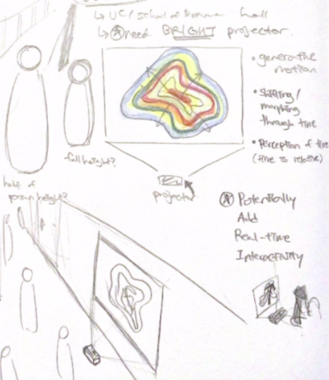
Tool
Morph from Ashley Kim on Vimeo.
Watching and listening to the crackling fire is one of the well known ways to relax on a cold winter day. According to the research from University of Alabama, the act of watching a burning fire lowers blood pressure, which then leads to lowering the stress level.
The overarching theme of this piece is Focus and Unfocus. The word 'Focus' in Latin meant hearth or fireplace because “rays of sunlight when directed by a magnifying glass can produce enough heat to ignite paper, a word meaning “fireplace” is quite appropriate as a metaphor to describe their convergence point.” This evolution of the meaning of the word ‘focus’ could also be seen as another form of morphing through time, which is part of the theme this piece revolves around.
The slow shifts in form as the fire burns create an imagery that appears to be iterative, yet anyone would agree that no two imagery of fire at a given millisecond interval are identical. The visible color gradient alters throughout time as the shape of the fire also changes. I’m hoping to translate this idea of generative, slowly morphing motion in my piece to create a similar effect as that of a crackling fire.
I planned and received an approval to have this public projection piece at the 5th floor of Carnegie Mellon University Gates & Hillman Center (GHC). The piece is visible as soon as one enters the building through the Pausch bridge, which is built in the memory of professor Randy Pausch, who is also well-known for his "Last Lecture". The bridge connects one of the Fine Arts buildings and the Computer Science building, which symbolizes professor Pausch's passion for the integration between computer science and art. Also containing the cs and art connection through the usage of computer graphics and randomized algorithms in its visual creation, the public projection piece Morph is presented at the top of the helix on the 5th floor to symbolize the blend between the two fields.
Progress of Time
We notice the progress of time through objects’ change of status or visible motion. However, it’s also easy to lose track of time when the mind is occupied with so many things. Through this piece, I intend to invite the viewers to ponder about how they’re noticing the flow of time and further reflect on themselves to see how many things are occupying their minds.
Meditative
Referring back to the University of Alabama’s research result, watching a slow shift in color and shape accompanied by crackling sound of a fire lowers the blood pressure. Similarly, the slowly morphing lines that resemble an organic form would make the viewers feel more relaxed. The bustling location of the projection would also encourage more audience to step away from their busy routine to enjoy the meditative experience for a quick moment.
Melting Boundaries
The motion in the video blurs the past lines and overlaps with newly generated lines. This shift that could only be noticed through the progress of time removes the boundary of a form, allowing generative movement to take place. The merge of randomized algorithms and visual components like lines and colors in the video also represents the blending of computer science and art. As an artist studying both Computer Science and Art, I hope this piece to also embody my passion for the merge of computer science and art. The location being right off of the Pausch bridge, as explained earlier, adds to the overlapping interdisciplinary field as well.
After a long day of sitting in a lecture hall and staring at a monitor screen, it’s finally time to go back home. The days got cold even before I noticed it. Trees are already half bare even before I had a chance to enjoy the colorful autumn leaves. Putting my arms through the puffy jacket, I started to think about what I should do once I arrive home. ‘I have that big project due this weekend,’ I thought to myself. No time to go see the fall leaves. I got so much to do in the evening, even after a long day of work. I packed my bag and walked down the long dreary hallway towards the stairs. The same greyish marble-like floor made the hallway even gloomier.
Some glimpse of colors. That’s what I first saw through the corner of my eyes. Huh, something’s moving in this lifeless hallway. I raised my head and in front of me was a projection of a bunch of lines in gradients of colors swimming across the monochromatic wall. They seemed to follow some pattern, yet each iteration was slightly different than the previous one. ‘This wasn’t here before,’ I thought, as I still have my eyes fixed to the forever-shifting abstract shape on the wall. Even if it’s something I wasn’t expecting to see at this place or time, the smooth change in forms and colors brought a sense of comfort inside me. It was like finding comfort from a slowly burning fire in a fire pit. My hardworking brain that attempted to look up this metamorphing shape on its own collection of data decided to halt on its examination. Instead, it started to take a short break as I blankly watched the projected motion.
Perhaps completing one work after another with barely any break for weeks exhausted me so much that I don’t even have a moment to notice that I am indeed in need of a break. After a short, meditative moment of watching this unexpected projected motion, I was reminded of the work I have to finish this evening. I had to go, but looking at these movements of shapes gave me a moment of not having to think about the long list of tasks I need to complete. It’s a small serendipity in my mundane life.
Although this translated the best to the projection, the simple grayscale isn't colorful at all. Even if I modify it to be colored, I thought the imagery filling up the screen made the projection piece look trapped inside the screen size.
This motion may seem interesting at a first glance, but I felt it wasn't providing the meditative nor melting boundaries experience as much as I imagined. I made several variations to try out how I could achieve the themes I chose using this movement, which are shown below.
(different line weight + opacity + number of instances)
I love the generated thin lines giving a mesh-like visual texture in this variation. Although each line is distinct from the next, the form at a distance seems connected, which represents the melting boundaries aspect of the project vision. However, these thin lines was barely visible through the projector, so I had to look for another motion variation that fits my idea.
(different line weight + opacity + number of instances)
The fast pace of this variation allows the distinct lines to look continuous at a moment, but the fast pace felt more distracting and dizzy than meditative. After trying numerous variations of this motion, I decided to not use this but rather utilize the second motion for the project.
This was the initial idea I had, a slow shape-and-color-shifting motion. Unlike the glowy, mystic feel the motion gives on screen, the same motion on projector didn't translate all the details enough to produce the same feel.
This is the variation of the second motion such that the active visual doesn't occupy the entire screen. I also added color noise to have it shift in color as well. After conducting the projector screen testing, I noticed that the colors appeared to fade a little faster than I wanted them to. I also decided to increase the brightness and saturation of the colors so that it translates to the amount I want through the projector.
Morph (2021) documentation on Youtube
Morph (2021) from Ashley Kim on Vimeo.
Through this project, I learned how to use Touchdesigner and write compelling proposals in the process of bringing this project together. Since I planned to use the projector from the start, I also had a fun experience of testing with the built-in projector prior to the exhibition period. Producing multiple versions of posters and description, as well as the moving poster and the QR code, summed the entire project together to have it presentable to the public.
Overall, I'm happy that I had the opportunity to present my work in public at the Carnegie Mellon University Gates & Hillman Center. Although they do have a couple of digital art pieces displayed throughout the building, the building itself isn’t a common environment to display artwork, so it was a fun experiment to see how the audience interact with the art piece that isn't presented at an environment where art isn't expected. Similar to my Power of Duckie (2021) public conceptual piece, I enjoyed watching others view my work in public and show different reactions towards it. I think this project is very successful because not only am I happy with every part of the process and the result, I also heard various positive feedback from people who viewed the piece.


